
A key part of our success in the market research and insights profession is based on how well people comprehend and retain our results. And a huge aid to comprehension and retention is data visualization. That’s why we teach a course on data visualization and one on infographics. It’s also why I was thrilled for the recent opportunity to co-present with the amazing Daren Jackson from DisplayR. We held a free webinar on data visualization specifically for market research and insights professionals. If you missed it, the highlights and playback access are below.
Two Categories of Visualizations
First, Daren shared fresh options for conveying survey data results with intuitively easy visualizations, and then I gave examples of visualizations that synthesize key insights for executive audiences.
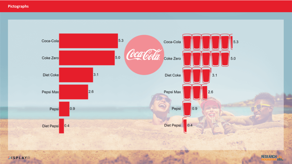
As an example of the first type, check out Daren’s example of the Coke pictograph…He shared many more in the webinar (ever seen a “palm tree graph”? You want to see this!).
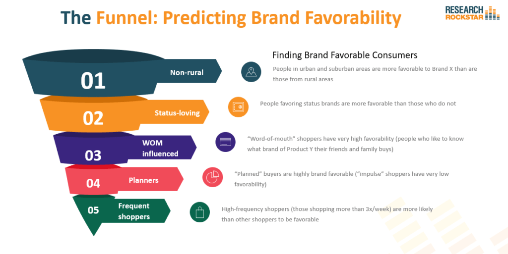
And as an example of synthesis visualizations, consider this example of a funnel graphic. Here, applied to a hypothetical project that used CHAID or some other tree analysis to identify predictors of brand favorability. Notice there are no percents. We are using the proportional size of the funnel parts to convey which predictors are the most to least powerful. This could be a great way to convey the “so what” results all on one page, while leaving the details (and the many percentages) for the body of the report.
Want more on data visualization? Three of my favorites sites for data viz inspiration are as follows:
- Information is Beautiful: the visually amazing blog by David McCandless, with lots of great examples.
- Venngage. Yes, there are other design platforms with templates available, but I just love the examples on Venngage.
- The Data Viz Project by Ferdio. Having such a simple display of so many options all on one page makes it very handy (I have it bookmarked).
And of course, to view the webinar, you can access the playback here.
About DisplayR
DisplayR is the only drag and drop Business Intelligence tool designed to analyze, visualize, report, and share insights from survey data. This tool helps you transform survey data into powerful and visual stories.