A common frustration for researchers has nothing to do with data quality or methodological rigor. We design strong studies, invest weeks in fieldwork and analysis, and deliver reports filled with meaningful insights—only to find that nothing happens next. The report isn’t read closely, the findings aren’t referenced, and the insights never quite make it into real decisions.
This is what we call the utilization gap. It’s the space between doing great research and seeing that research actually used.
The problem usually isn’t that stakeholders don’t care. More often, they struggle to absorb the findings in a way that makes them feel clear, relevant, and actionable. When that happens, even excellent research loses momentum before it has a chance to influence strategy.
One effective way to close the utilization gap is by rethinking how we communicate insights. At Research Rockstar Training, one of the core approaches we teach is visual storytelling.
In our short video, Making Research Matter: Closing the Utilization Gap, we walk through how visual storytelling helps researchers present findings in a way that is easier to follow and more likely to inspire action. This approach isn’t about flashy charts or decorative visuals. It’s about combining a clear narrative with well-chosen proof points and visuals that support the logic of the story and guide the reader through it.
The key idea is simple: visuals should function as communication tools, not graphic design exercises.
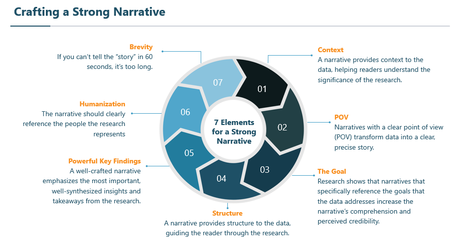
At the foundation of visual storytelling is a strong narrative (what some people call storytelling). In our course, we teach seven elements that support an effective narrative: context, point of view, a clear goal, structure, powerful key findings, humanization, and brevity. When these elements are in place, the report becomes easier to write and far more engaging to read.

Brevity is often the most surprising element. Many of us were trained to be thorough when summarizing our qualitative and quantitative research results, and that instinct serves us well during analysis. But when it comes to communicating findings, focus matters more than volume. A useful test is whether we can explain the project’s core narrative in about sixty seconds. If we can’t, the message is likely too diffuse to land with impact.
One practical technique for finding that narrative is drafting a point-of-view sentence. It uses a simple structure:
- “The most important recurring theme in this research is ___, which can help the organization achieve ___.”
Even when the sentence is a bit long, it forces clarity. Stakeholders immediately understand why the findings matter, and researchers gain a clear guide for selecting the most relevant proof points and visuals for building a report. The result is a deliverable that avoids data dumps and gets straight to the meaning.
These ideas are explored in more depth in our course, Visual Storytelling for Market Research and Insights, which is designed for researchers working across market research, UX, CX, consumer insights, and business intelligence.
If you’ve ever watched a strong report fail to gain traction, the video is a useful place to start. Because research should serve as the beginning of a decision—not the end of a project.


